Overlay Introduction (Data Center and Server)
Overview
You know the problem: Small changes in long tables require many clicks. Switching between view and edit modes is very time-consuming. Use our solution and save time – every time! Change table cells quickly with a simple double-click.
The Inline Table Editing tool allows users to directly edit the content of a table without switching to the edit mode, which is very convenient when working on pages with a lot of content. In this documentation section you can find more information about inline edit in Data Center using overlay functionality.
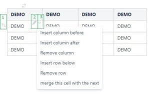
Editing with overlay is done using the following icons:
-
Move the full row by using the inserted gray arrow icon to drag it
-
Edit the cell by clicking on the inserted gray pencil
-
Dropdown icon for editing the following options:
-
Insert column before, insert column after
-
Insert row below
-
Remove column, remove row
-
Merge this cell with the next one
-
Configuration
The admin is able to configure the Inline Table Editing plugin up to a certain point.

To open app settings in Data Center, please navigate to Manage apps, expand app menu and click on Configure.
You will see Inline Table Editing settings page.

On this page you can decide, where overlay and Wrap to macro option should be shown, if Wrap to macro icon should be visible at all, set button layout, disable perfomance setting and decide, if it is allowed to collect anonymized error tracking.
The following settings are available:
|
Setting |
How is used |
Link |
|---|---|---|
|
Enable Inline Table Editing |
Provides possibility to specify, where overlay functionality and “Wrap to Inline Table Editing icon“ should be available. Spaces select below radio buttons provides the ability to specify spaces, if “For selected spaces only“ or “For all except selected ones“ option is chosen |
|
|
Macro icon visibility |
Provides possibility to disable visibility of “Wrap to Inline Table Editing icon“ |
|
|
Row button layout |
Provides possibility to display cell pointer on the right or on the left side |
Row button layout

This setting relate to overlay functionality only. The “Row button layout” option allows the user to choose, on which side of a table’s row the arrow should be shown.
Example: the arrow appears on the left side of the table

Or on the right side:

Use cases
Edit table elements (rows and columns)
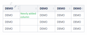
The user is able to add/remove columns using the “insert column before”, “insert column after”, and “remove column” options. These options are available to be used in any cell in the table.
The newly created column will be added before/after the column with the cell:
-
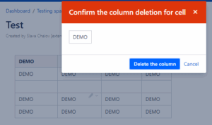
In case you want to remove a column, a warning message will appear. The user needs to approve this action:
-
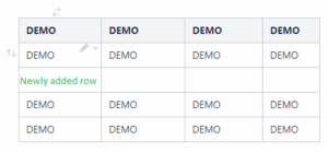
The user is able to add/remove or re-order rows, using the “insert row below”, “remove row” or “move row” options. Drag the row using these icons. These icons are available for use in all rows in the table, except the header row. It is not possible to delete or move the header row.
The newly created row will be added as shown below:
-
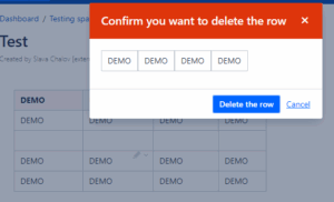
In case you want to remove a row, a warning message will appear as well. In this case, the user also needs to approve this action:
Edit table cells
The user is able to edit cells using the “Edit cell” pencil or just by double-clicking on the cell. These options are available in all cells in the table.
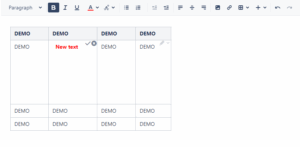
Besides the ability to insert any new content, the user can use the rich text editor. It allows the user to format the text or to put macros inside the table as shown below:
-
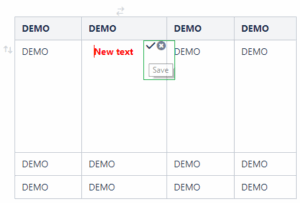
In order to save changes, click on the save button or use the hotkey “CTRL/Strg+S”
-
To cancel changes, click on cancel button.
-
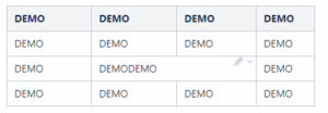
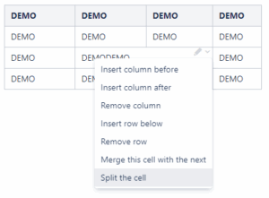
Also, the user is able to merge cells using the “merge this and next cell” option. This option is available to all cells in the table, except the cells in the last column.
-
After that, the cell can be split via the “Split the cell” option. This icon only appears for all merged cells.
Whitelisted macros
Inline Table Editing tool works inside whitelisted macros such as:
-
Column
-
Excerpt
-
Expand
-
Info
-
Note
-
Page properties
-
Panel
-
Section
-
Tip
-
Warning
-
Presentation slide
-
Presentation slide fragment