How to Build a Jira Pivot Table Report with Universal Visual Builder


Are you a project manager suffering from the limitations of the pre-installed Jira reporting options? Would you like to present complex calculations in different settings in a visually appealing way? Do you crave the ability to create any report quickly according to your requirements easily?

If so, Universal Visual Builder will change your reporting experience. Configure Jira's built-in reports and create different reports quickly without switching back and forth between different input masks multiple times.

A Jira pivot table report groups your issues by any two or more Jira fields and calculates a value for each intersection. In Report Builder, you build one with the Universal Visual Builder: click New Report, choose Basic Charts and Reports → Blank Universal Visual Builder, set the scope, then add grouping fields to rows and columns and pick what each cell should calculate. No code, no JQL required.

At a glance

What you build: a Jira pivot table — or a simple table, pie, donut, bar or number chart — grouped by any standard or custom Jira field.
Who it is for: Jira admins, project managers, Scrum masters and PMO teams who have outgrown Jira’s built-in reports.
You will need: Report Builder installed in Jira, and permission to browse the projects you want to report on.
Time required: about five minutes for a first working report.

Why Jira’s built-in reports hit a wall

Jira has no native pivot table. The closest built-in option is the Two-Dimensional Filter Statistics gadget, and it carries two limitations that are documented in Atlassian’s own guidance and turn up in a long trail of Community threads:

  • Exactly two dimensions. One field on the X axis, one on the Y axis. There is no way to nest a third or fourth grouping.
  • Only fields with a fixed set of values. Select lists, multi-selects, user and group pickers, versions. Numeric fields are excluded — which means Story Points, Original Estimate and other number fields cannot be used as axes at all, because they would produce an unbounded list of values.

That second limit is why “sum story points by epic and assignee” is one of the most repeated unanswered questions in the Atlassian Community. It is not a configuration mistake; the native gadget genuinely cannot do it.

The Universal Visual Builder removes both constraints. You can add as many grouping fields as you need to rows and columns, use any Jira field type including custom fields, and apply real aggregations — Sum, Average, Median, Minimum, Maximum, Count — to numeric data. The rest of this guide walks through building one.

What is the Universal Visual Builder?

The Universal Visual Builder (formerly the Universal Report) is Report Builder’s general-purpose report editor, created from the Blank Universal Visual Builder option under Basic Charts and Reports. It turns Jira issues into pivot tables and charts using three familiar business-intelligence concepts:

  • Scope — which Jira issues are analysed.
  • Grouping fields (dimensions) — how the data is split across rows and columns.
  • Cell content — what is calculated or displayed for each group.

Because it accepts every Jira field type, the same builder covers progress tracking, project status, workload distribution, time-in-status analysis and KPI summaries without writing a line of code.

Before you start

  • Report Builder is installed in your Jira instance (Cloud, Data Center or Server).
  • You can browse the Jira projects whose issues you want to report on.
  • Optional: a saved Jira filter or a JQL query, if you already know exactly which issues belong in the report.

Step 1: Create a new report in Jira

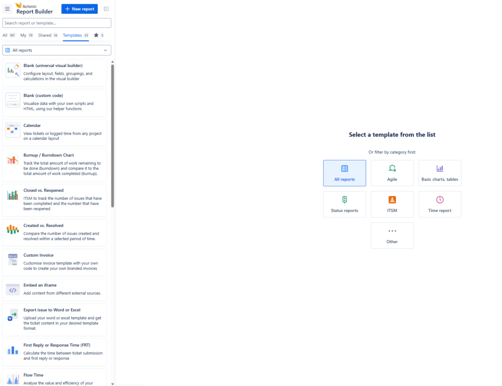
Click New Report.

The New Report menu in Report Builder for Jira

In the report type selection, choose Basic Charts and Reports → Blank Universal Visual Builder. Report Builder creates the new report automatically.

Step 2: Understand the default pivot table

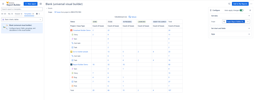
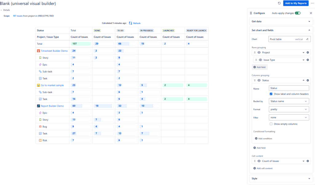
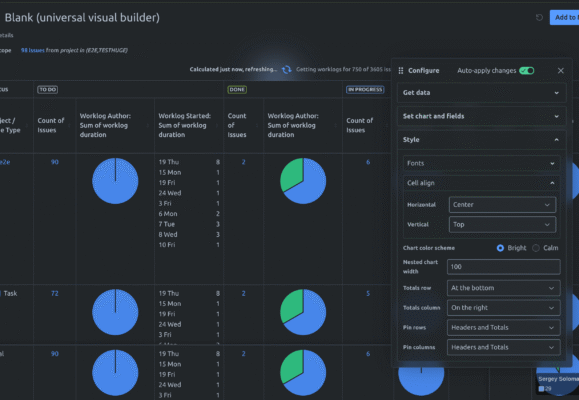
A newly created Universal Visual Builder report contains a Pivot Table by default.

The scope is pre-set to the last Jira project you worked with, so there is already data on screen and you can start configuring immediately instead of selecting a project first.

Step 3: Set the report scope — projects, filters or JQL

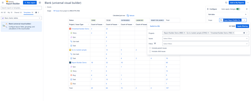
The scope controls which Jira issues feed the report. To change it, click Scope.

Setting a Jira report scope with projects, filters, conditions and JQL

You can define the data source by:

  • adding one or more Jira projects;
  • selecting saved Jira filters;
  • defining additional issue filtering conditions;
  • using JQL for a fully custom scope.

JQL is available for people who want it, but nothing above requires it — combining a few projects and conditions covers most reports.

Several Jira projects combined into a single report scope

Step 4: Choose a Jira chart type

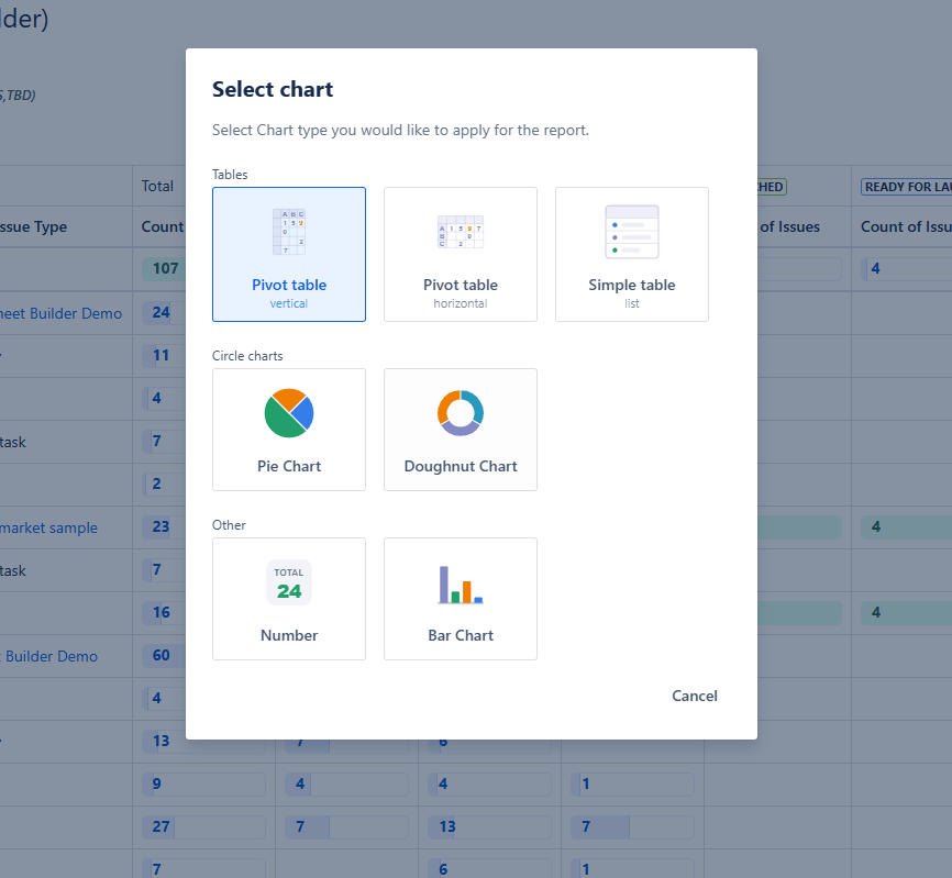
Open Set Chart and Fields, then click the current visualization type to see the options.

Jira chart types available in the Universal Visual Builder

Visualization What it shows
Pivot Table Vertical A pivot table with the main grouping arranged vertically.
Pivot Table Horizontal A pivot table with the main grouping arranged horizontally.
Simple Table A straightforward list of the data, without pivot-table grouping.
Pie Chart Data as segments of a pie — easy comparison of the relative size of categories.
Donut Chart The same idea as a pie chart, displayed as a ring.
Number Chart Calculated values as cards with prominent numbers — useful for KPIs, totals and counts.
Bar Chart Values as bars, for visual comparison between categories.

Show the data table next to a chart

For Pie, Donut and Bar charts, enable Show Table to display the underlying data table alongside the visualization, positioned Left, Right or Bottom. Stakeholders get the visual; analysts get the exact numbers behind it, in the same report.

Step 5: Group your Jira data by any field

Grouping fields — dimensions in BI terminology — split and organize the report. Add them to Rows or Columns, in any number, using any Jira field type including custom fields.

Adding a Jira field as a grouping dimension

How to add a field

  1. Click Add Field under the Rows or Columns grouping.
  2. Browse the available Jira fields, or use the search box.
  3. Select the field.

It is added to the corresponding grouping automatically. Add further dimensions to build nested groupings — this is the step the native two-dimensional gadget cannot match.

Step 6: Configure a grouping field

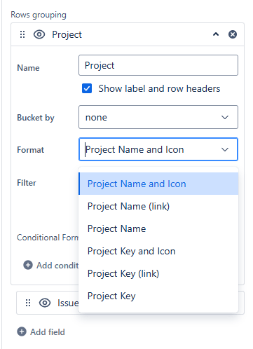
Once a field sits in Rows or Columns, you can control how it is displayed and how its values are organized. The available options depend on the Jira field type.

Configuration options for a grouping field

Rename a field

Change a field’s displayed name without touching the underlying Jira field, so the report can use clearer, audience-appropriate labels. You can also choose whether the field name appears in the report headers at all.

Bucket field values

Fields can be bucketed to combine values into larger groups — useful when you do not need every individual value on its own row.

Select a format

Depending on the field type, you can choose how values are formatted. Date fields, for example, can be displayed using different date-based formats and groupings, which is how you produce per-month or per-quarter breakdowns.

Filter a grouping field

Apply a filter directly to one grouping field to control which of its values appear — narrowing a single dimension without changing the overall report scope.

Show empty and null values

Choose whether the grouping includes empty rows and null values — issues where the selected field has no value. Worth turning on deliberately: unassigned or unestimated issues are often exactly what a report needs to surface, and excluding them silently understates the problem.

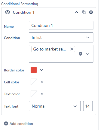
Add conditional formatting

Conditional Formatting highlights particular values or cells based on conditions you define.

Conditional formatting rules applied to a grouping field

It can change the border color, cell color, text color and text font — so breaches, overloads and outliers are visible at a glance rather than found by reading.

Step 7: Define cell content — measures, fields, subtables and subcharts

Cell Content is what actually appears in the table or chart. Rows and columns decide how data is grouped; Cell Content decides what is calculated or displayed for those groups. Click Add Cell Content to open the options.

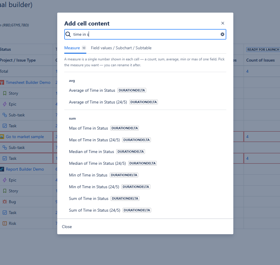
Add measures

Report Builder offers measures for measurable Jira fields, and the available measures depend on the field you pick.

Choosing a measure for cell content

Numerical fields provide the standard aggregations: Average, Minimum, Maximum, Count, Sum and Median.

Other Jira data brings its own specialized measures. Time in Assignee, Time in Status, Issue Status History and similar historical or time-based information have dedicated measures built for that kind of data, rather than generic number crunching.

Add Jira fields and field values as cell content

Cell Content is not restricted to calculated measures — you can add Jira fields and their values directly. A cell becomes a container for additional data and visualizations, holding:

  • a calculated measure;
  • values from Jira fields;
  • a subtable inside the main visualization;
  • a subchart inside the main visualization.

The main visualization supplies the structure while individual cells carry the detail — a level of nesting that spreadsheet exports and dashboard gadgets do not offer.

Step 8: Example — a subtable with a subchart inside a pivot table

This example uses Cell Content to put a detailed breakdown inside every cell of the parent table.

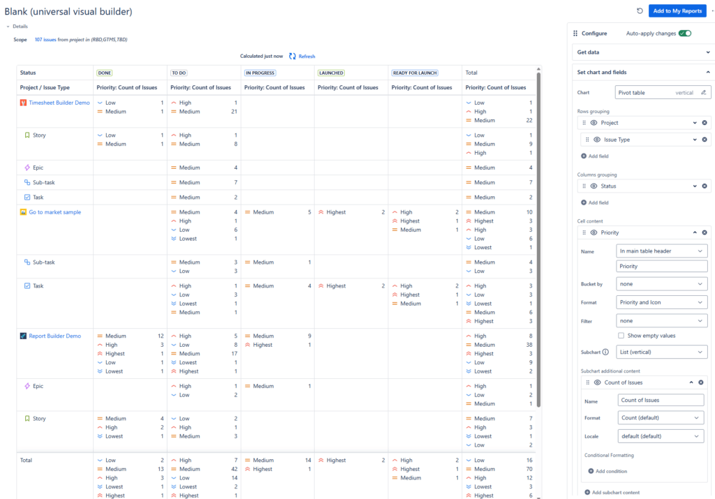
Subtable (nested list table) inside a parent Jira pivot table

  1. Add the Priority field to Cell Content and set it to display values as a vertical list.
  2. Add Count of Issues as additional content, displayed as a subchart.

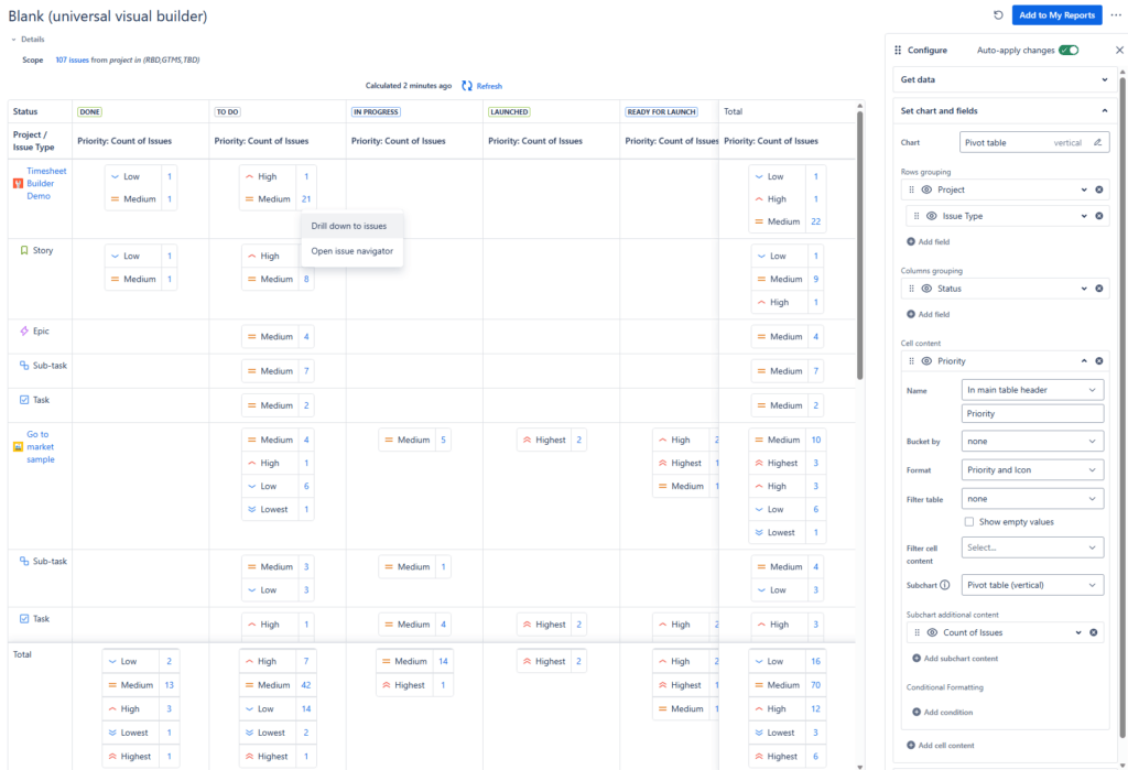
Each parent cell now shows every priority value with its issue count — a mini-report per cell instead of one aggregated number.

Subtable (nested pivot table) inside a parent Jira pivot table

Switching the subchart’s visualization type to a pivot table also unlocks the drill-down options available to the parent chart.

Step 9: Style the report

The Styling tab controls the report’s appearance and scrolling behaviour.

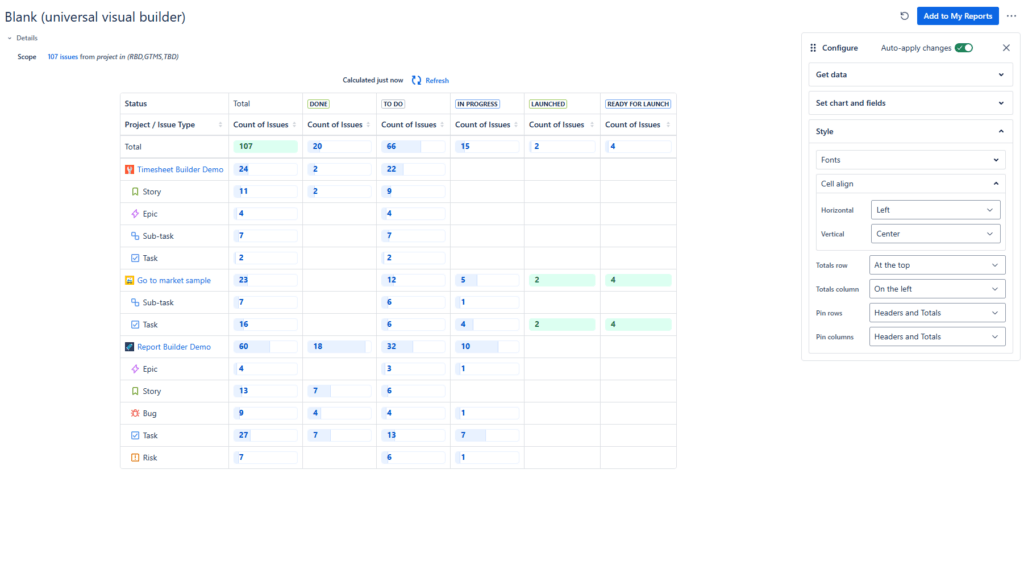
Styling options for a Jira report

Fonts

Adjust font size and font weight to make a dense report more compact or a shared one more readable.

Cell alignment

Set horizontal and vertical alignment for content inside cells — left, center, right or another position depending on the alignment type.

Pin totals and headers

On large reports, pin total rows, total columns and headers so they stay on screen while you scroll in either direction. Without this, a wide pivot table becomes unreadable past the first screen — you lose track of which column you are looking at.

Five Jira pivot table reports you can build this way

Each of these is the same nine steps with different fields. The first one is the report Jira cannot produce natively.

Report Rows Columns Cell content
Story points by epic and assignee Epic Link Assignee Sum of Story Points
Team workload by status Assignee Status Count of issues
Priority mix per project Project Priority Count of issues
Intake trend by month Created, formatted by month Issue Type Count of issues
Time in status by assignee Assignee Status Time in Status measure

For the first report, add Epic Link to Rows, Assignee to Columns, then add Story Points as Cell Content and choose the Sum measure. Enable pinned headers if you have many epics. This is the exact combination the Two-Dimensional Filter Statistics gadget rejects, because Story Points is a numeric field.

Frequently asked questions

Does Jira have a native pivot table?

No. Jira has no built-in pivot table. The Two-Dimensional Filter Statistics gadget is the closest native equivalent, but it is limited to two dimensions and only accepts fields with a fixed set of values. Pivot tables in Jira require a Marketplace app.

Can I sum story points by epic and assignee in Jira?

Not with native gadgets — numeric fields such as Story Points cannot be used in the Two-Dimensional Filter Statistics gadget. In the Universal Visual Builder, put Epic Link in Rows, Assignee in Columns and Story Points with the Sum measure in Cell Content.

Why can’t I select Story Points in the Two-Dimensional Filter Statistics gadget?

The gadget only supports fields with a defined, finite set of values — select lists, multi-selects, user and group pickers, versions. Numeric fields would generate an unbounded list of axis values, so they are excluded by design.

Can a Jira report group by more than two fields?

Yes, in the Universal Visual Builder. You can add as many grouping fields as you need to Rows and Columns to create nested groupings. The native gadget is capped at two.

Can I build a Jira report without JQL?

Yes. Select projects, saved Jira filters or filtering conditions in the Scope configuration. JQL is available for custom scopes but is never required.

Can I report on Jira custom fields?

Yes. All Jira field types are supported — standard and custom — both as grouping dimensions and as cell content.

What is the difference between a grouping field and cell content?

Grouping fields in Rows and Columns determine how the data is split. Cell Content determines what is calculated or displayed for each of those groups.

Which aggregations are available?

Numerical fields support Average, Minimum, Maximum, Count, Sum and Median. Time-based and historical data — Time in Status, Time in Assignee, Issue Status History — has its own dedicated measures.

Can I show a Jira chart and its data table at the same time?

Yes. Enable Show Table on a Pie, Donut or Bar chart and place the table Left, Right or Bottom.

Can one report cell contain its own chart?

Yes. Cell Content can hold a subtable or a subchart, so each cell of the parent visualization becomes its own mini-report.

How do I include Jira issues with empty field values?

Enable empty rows and null values in the grouping field configuration, so issues with missing or unassigned values appear instead of being dropped.

How do I keep headers visible in a large Jira report?

Use the Styling tab to pin total rows, total columns and headers.

Is the Universal Visual Builder the same as the Universal Report?

Yes. The feature was previously called the Universal Report and is now the Universal Visual Builder, reached via Basic Charts and Reports → Blank Universal Visual Builder. Older documentation, videos and blog posts may still use the former name; the functionality described in this guide is the same feature.
Next level Jira Reporting with Report Builder

  • Create your own Jira custom reports
  • No-code approach for intuitive usage
  • Export reports to CSV, Excel or PDF
Go to Atlassian Marketplace

How useful was this post?

Click on a star to rate it!

Average rating 5 / 5. Vote count: 2

No votes so far! Be the first to rate this post.