As mentioned above, Jira is excellent at collecting and storing quantifiable data about tasks. The tickets in your team’s Jira projects contain all the information you need:
-
Number of tasks assigned to team members
-
Estimated time required per task
-
Time already spent on each task
-
Remaining time required per task
With this data, you can answer the following questions:
-
How are tasks distributed among team members in terms of the number of tasks?
-
How are tasks distributed in terms of time required per task?
-
Which team members are making progress and which ones need support?
In larger projects, additional data points can provide more valuable insights. By incorporating more information from Jira when assessing the situation, you can also answer the following questions:
-
Which issue types involve the most work? Are they tasks, stories, bugs? Is someone overwhelmed by a specific type of task?
-
Which task priorities require the most time? Are high-priority tasks evenly distributed within the team, or does one person (perhaps the senior member) handle everything important?
-
How many tasks are in open, in progress, or other statuses? Is there a bottleneck you need to address?
-
Who creates the most tickets and why (reporter)? Which customers generate the most work for the team (e.g., for a support or service management team)?
-
If your team members are working on multiple projects simultaneously: How are tasks distributed across projects?
-
How is work distributed within a sprint? Is the sprint goal achievable?
-
Are different aspects of a large project (marked by components or labels) being driven forward evenly?
-
Which tasks were estimated accurately? Which are taking longer than planned?
The key is to include only the data relevant to your situation in your analysis, while ignoring the rest. Not all of the above data points will necessarily yield an “a-ha moment” in your specific case. Often, a significantly smaller set of data points is sufficient to gain the insights you need.
But why should you even conduct such an analysis? As a team or project leader, it’s crucial to manage a healthy and balanced team. In this context, “healthy” refers to the distribution of tasks, avoiding over- or underload, and fostering a collaborative work environment. Such a team climate not only contributes to a positive working atmosphere but also has far-reaching effects on productivity and overall project success.
With the right evaluation of the available data, you can identify, for example, if a particular team member is consistently handling many large tasks and who that person is. Conversely, you might learn that another team member is only completing a few small tasks, which would indicate an unequal task distribution – something you can only address if you’re aware of it.
A team that does not work together harmoniously will inevitably show reduced performance. If team spirit suffers, individual motivation decreases, leading to lower productivity. Projects may not be completed on time, or the quality of work may suffer.
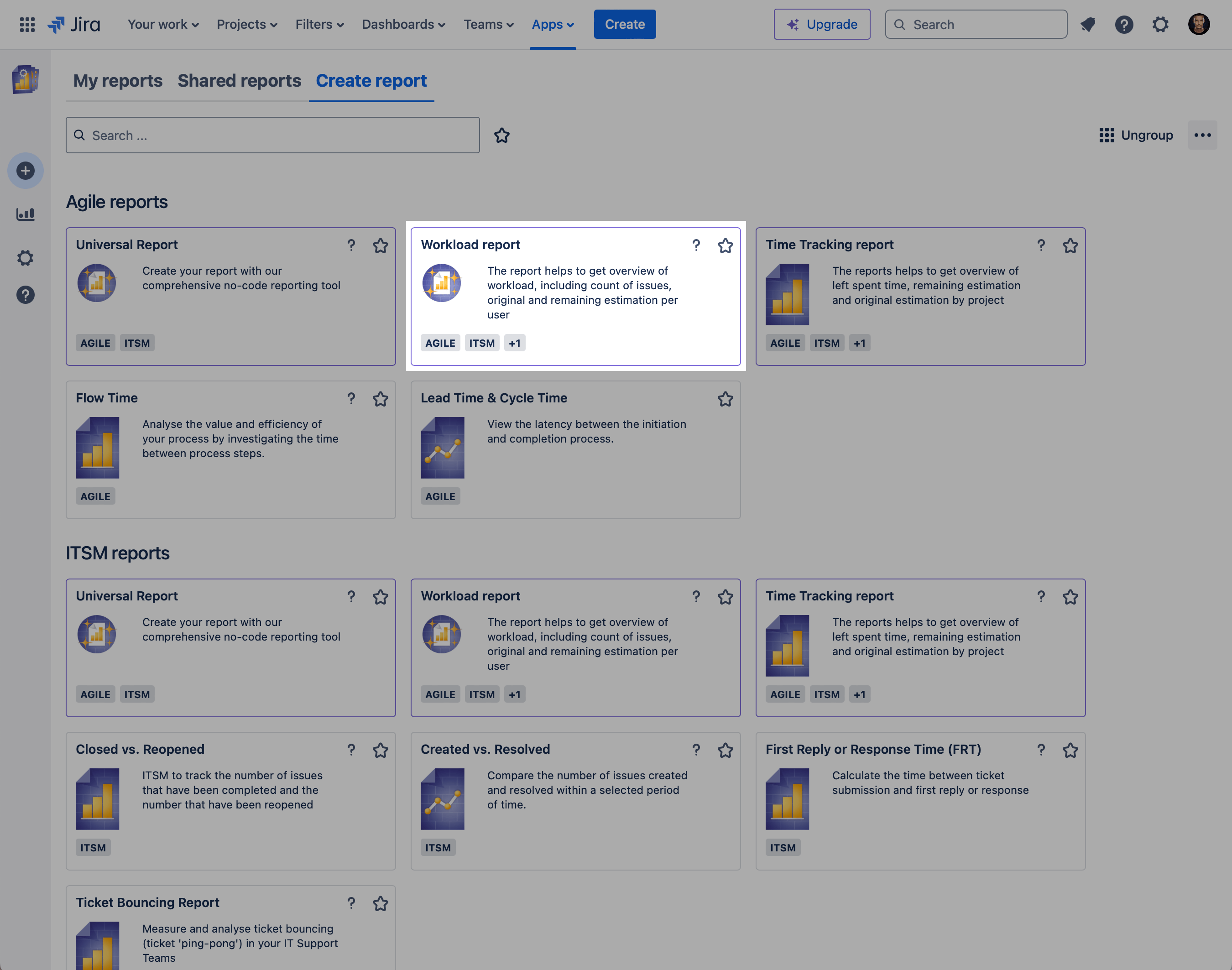
But how do you create such a report that provides the necessary insights? This is where the Report Builder app from Actonic comes into play. The newly released “Workload Analysis” report includes the essential metrics mentioned above and offers the flexibility to add and arrange additional data points as desired. To get started, click on the corresponding template in the app’s gallery:
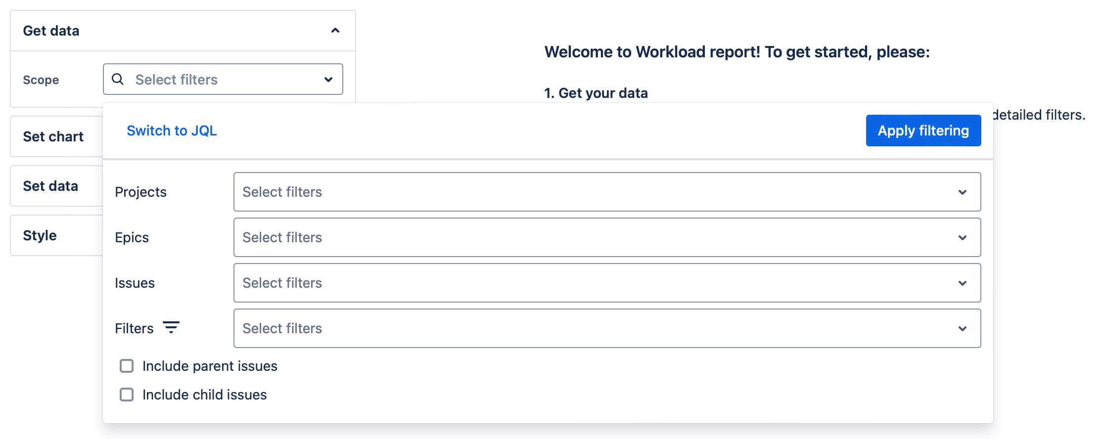
First, choose a data source. This could be one or more projects, specific epics and their tickets, individually selected issues, or existing filters. For a more specific selection of the scope, you can also switch to a JQL input.
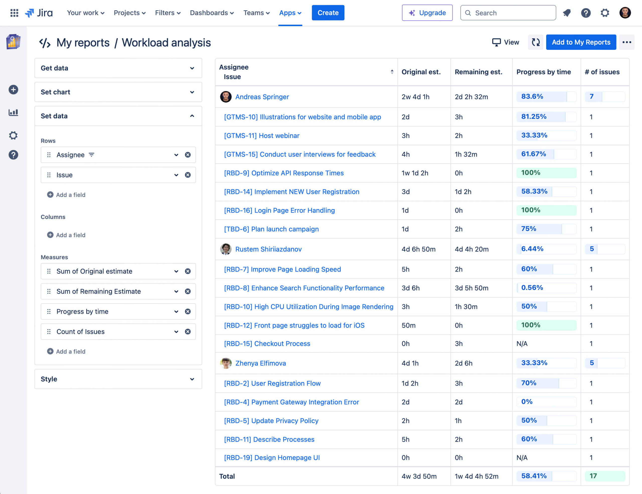
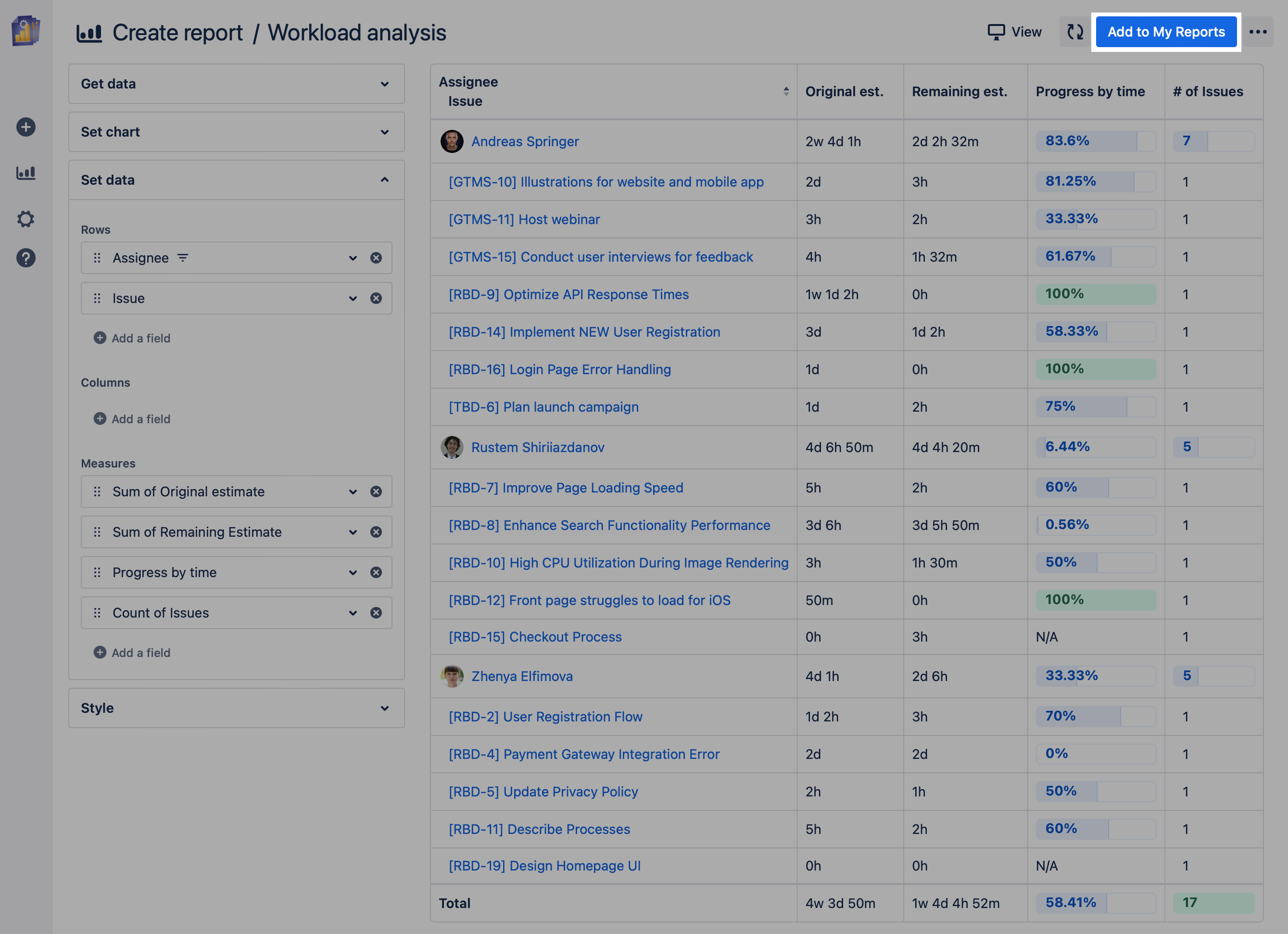
After this simple step, a pivot table with the key data is immediately created. At a glance, you can see…
-
… who in the team has how many tasks assigned,
-
… how these tasks are estimated,
-
… how much time is still remaining for each task,
-
… and the percentage of progress per task.
To increase the informative value of the data, we’ve added a new formatting option: inline bar charts! This new visualization displays numerical values as easily digestible diagrams, making it easier to evaluate data directly in the table. As of the time of this article, this works with the following metrics:
-
“Progress by time”
-
“Count of issues”
-
“Count of Created Issues”
-
“Count of Open Issues”
-
“Count of Resolved Issues”
-
“Count of Status Changes”
Inline bar charts will soon be available for other numerical metrics as well.
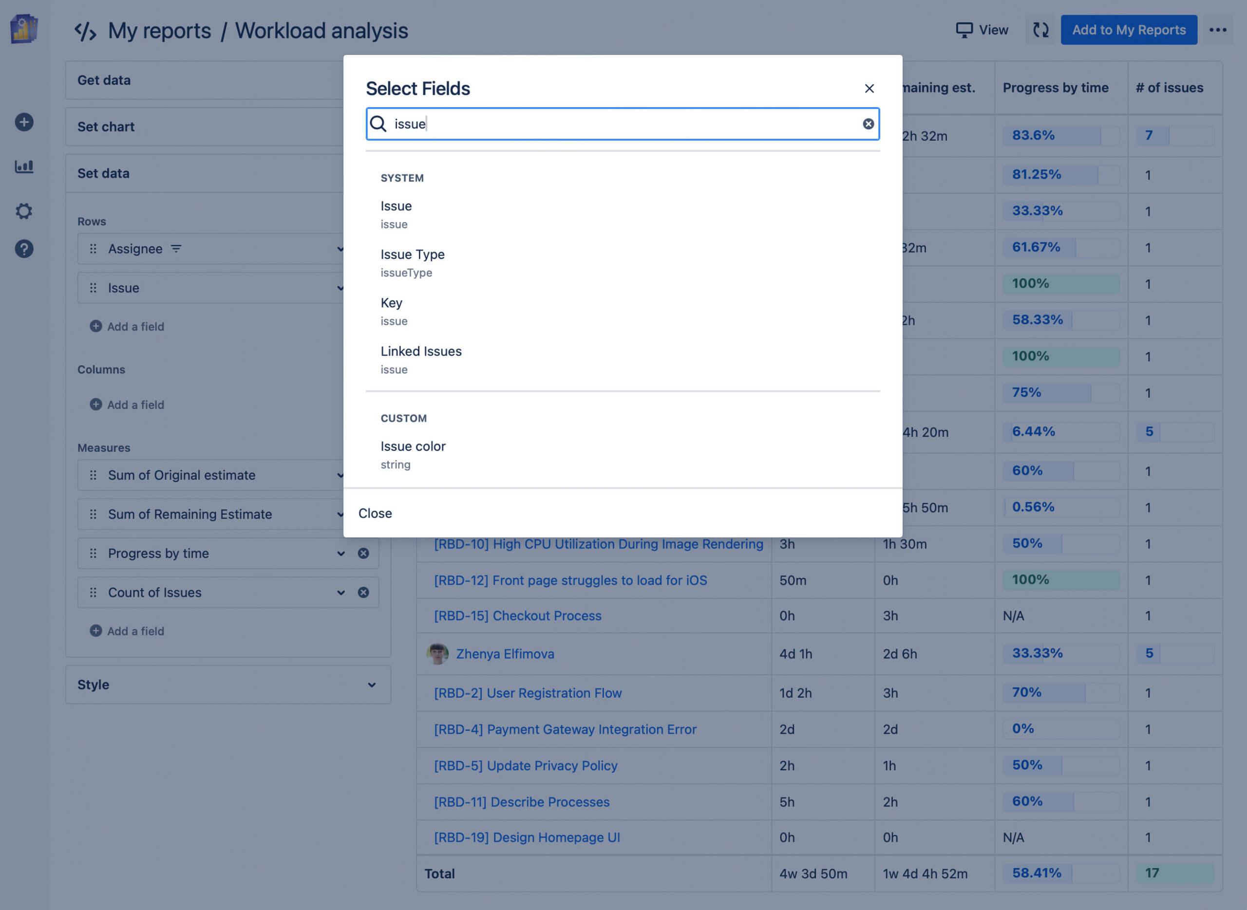
In addition to the standard data in this report template, you can easily add more metrics by clicking “Add a field” under the “Rows,” “Columns,” or “Measures” sections and then selecting the desired information:
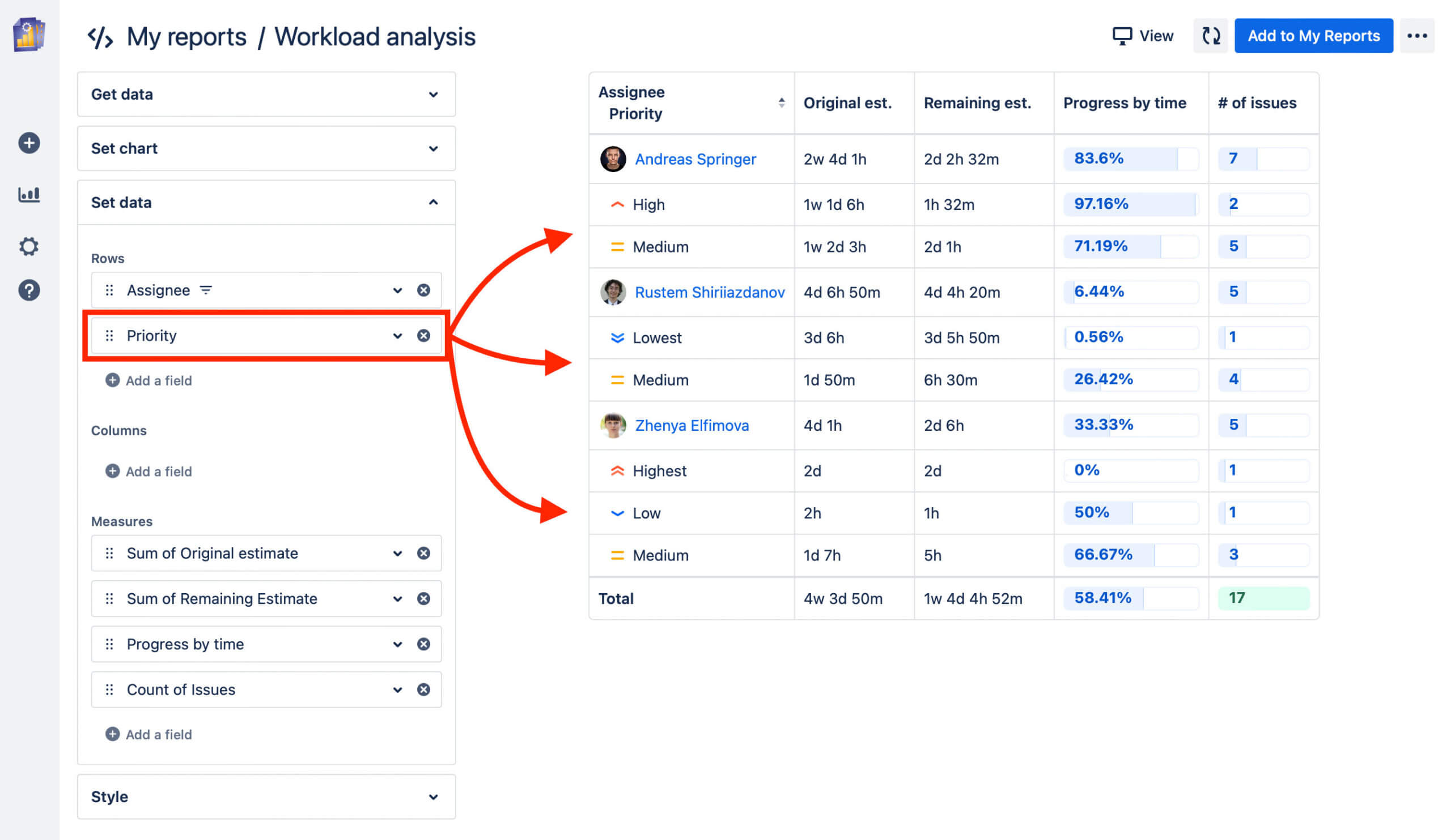
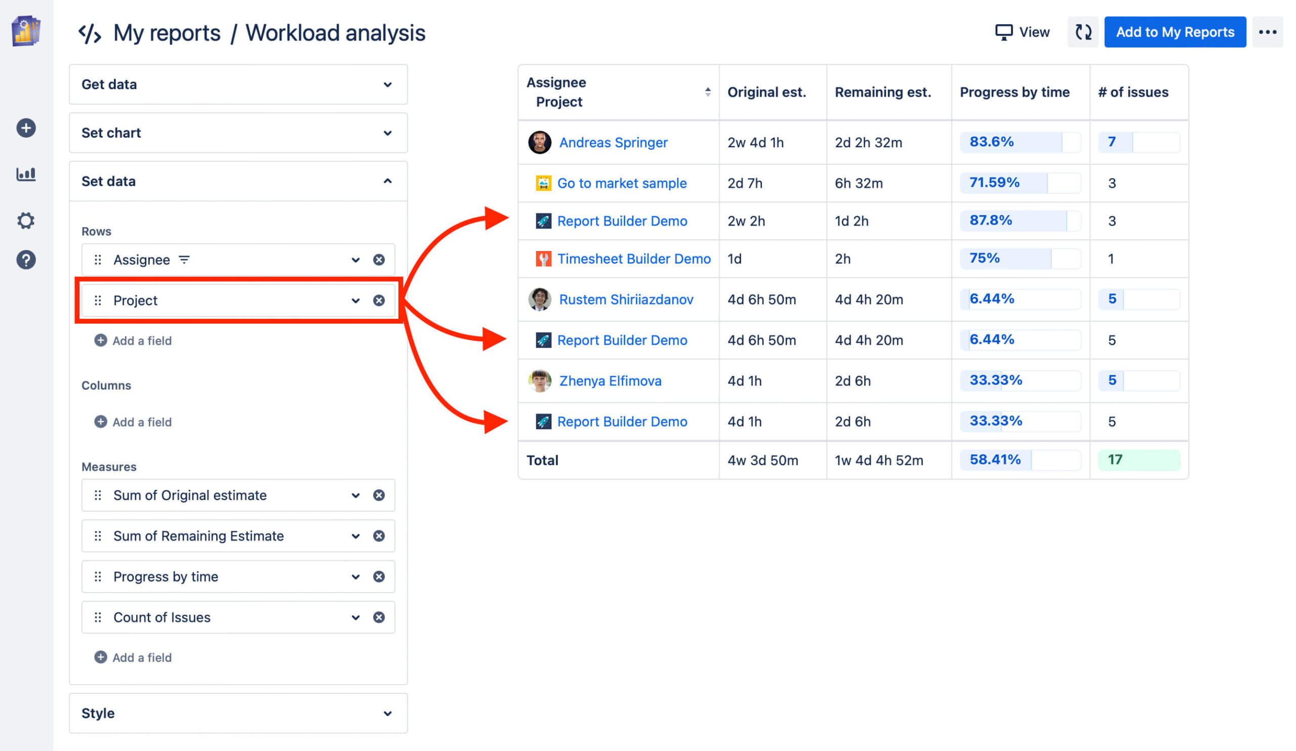
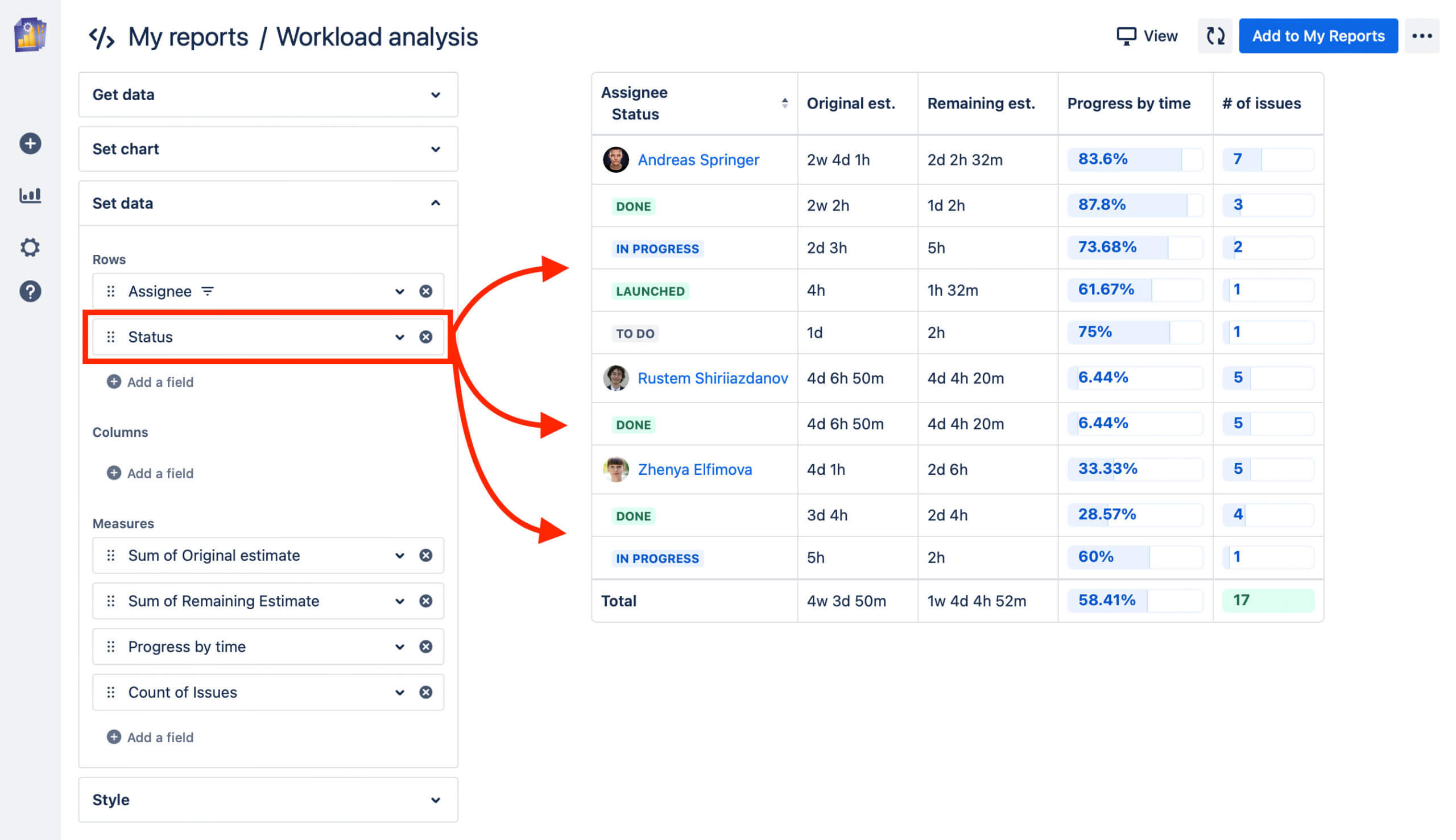
This allows you to customize the report according to your needs. Here are a few examples with various configurations that include some of the data points mentioned above:
Task distribution by priority:
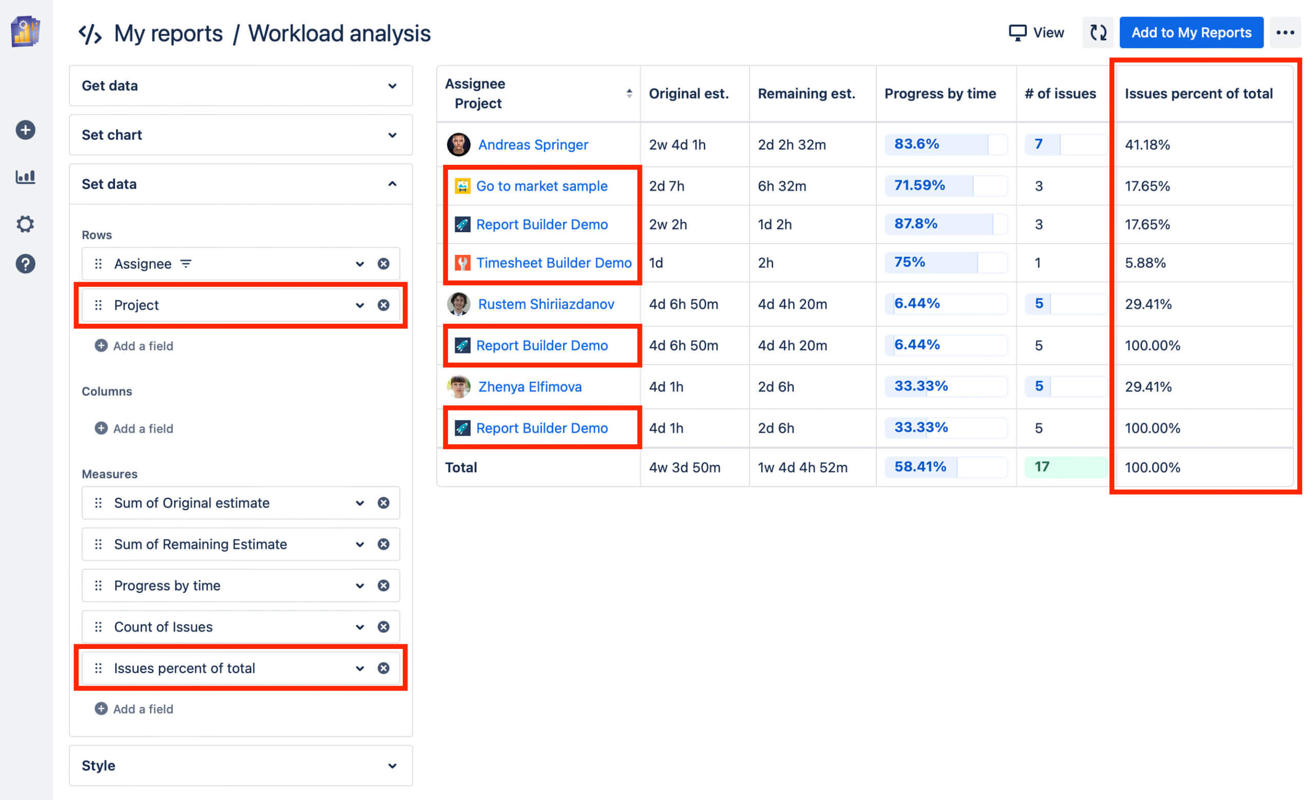
Cross-project task distribution:
Task distribution by status:
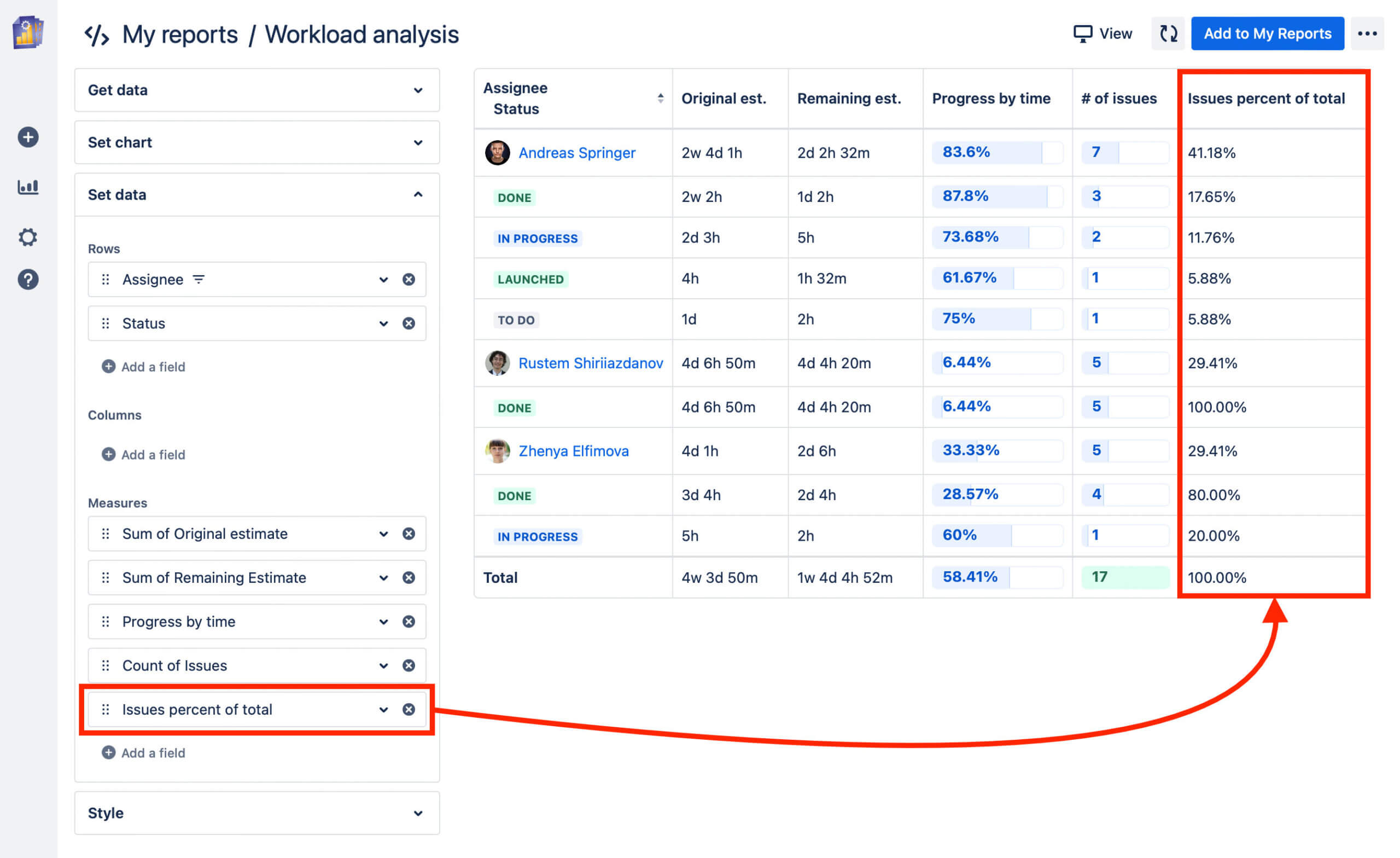
Percentage workload distribution:
Of course, the dimensions can also be combined at will, making it possible to display the percentage distribution across projects, for example.
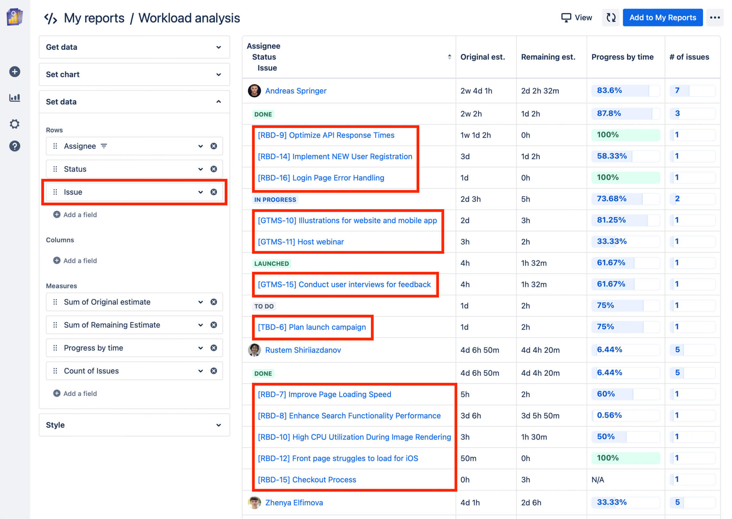
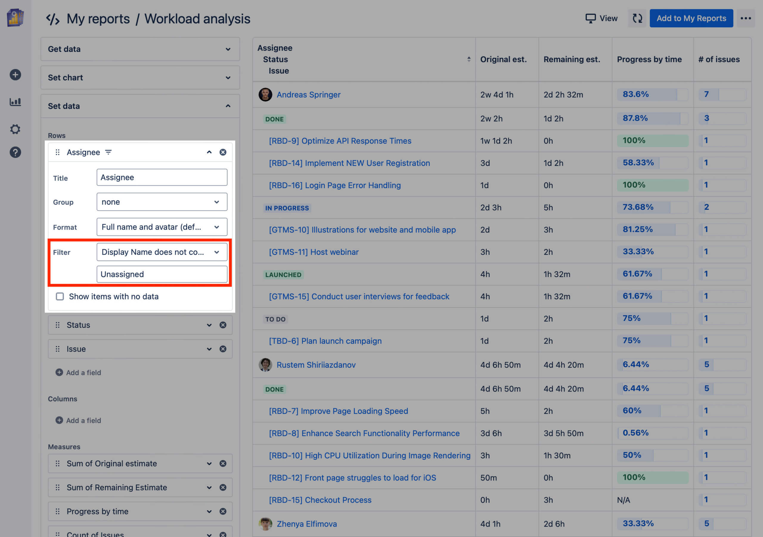
As you may have noticed, the rows for the actual tickets were removed in the views above. This helps keep the overview clear. However, you can display the issues here as well by simply leaving the corresponding field below the “Status” field, as in this example:
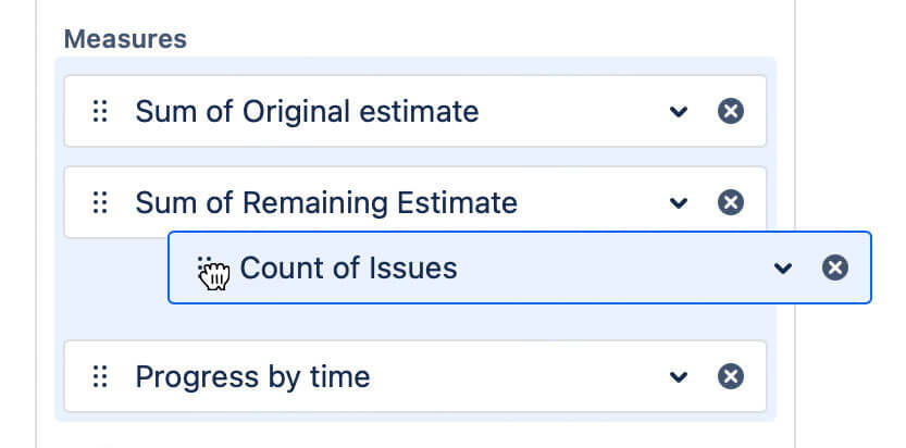
You can drag the existing fields by their handles on the left side, place them elsewhere, and thereby adjust the display accordingly.
The fields themselves can be expanded to use additional options. For example, you can filter data, format it, or change the title that appears in the table.
In the following example, I’ve filtered out all unassigned issues to keep the table concise (“Display name does not contain ‘Unassigned’”).
Save the report by clicking on “Add to My Reports,” so your individual configuration is available for repeated use.
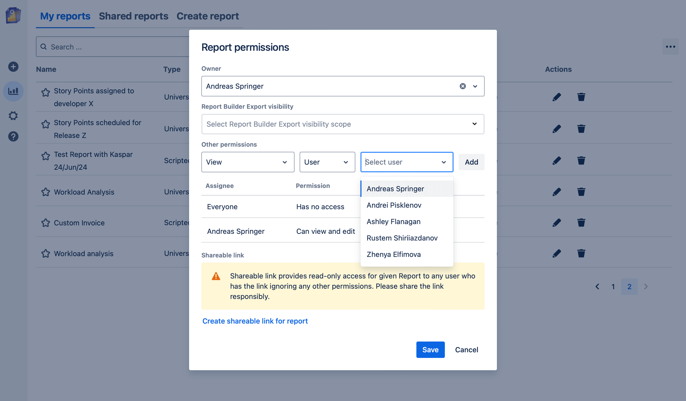
To make the report accessible to other users within Jira, you can assign viewing or editing permissions…
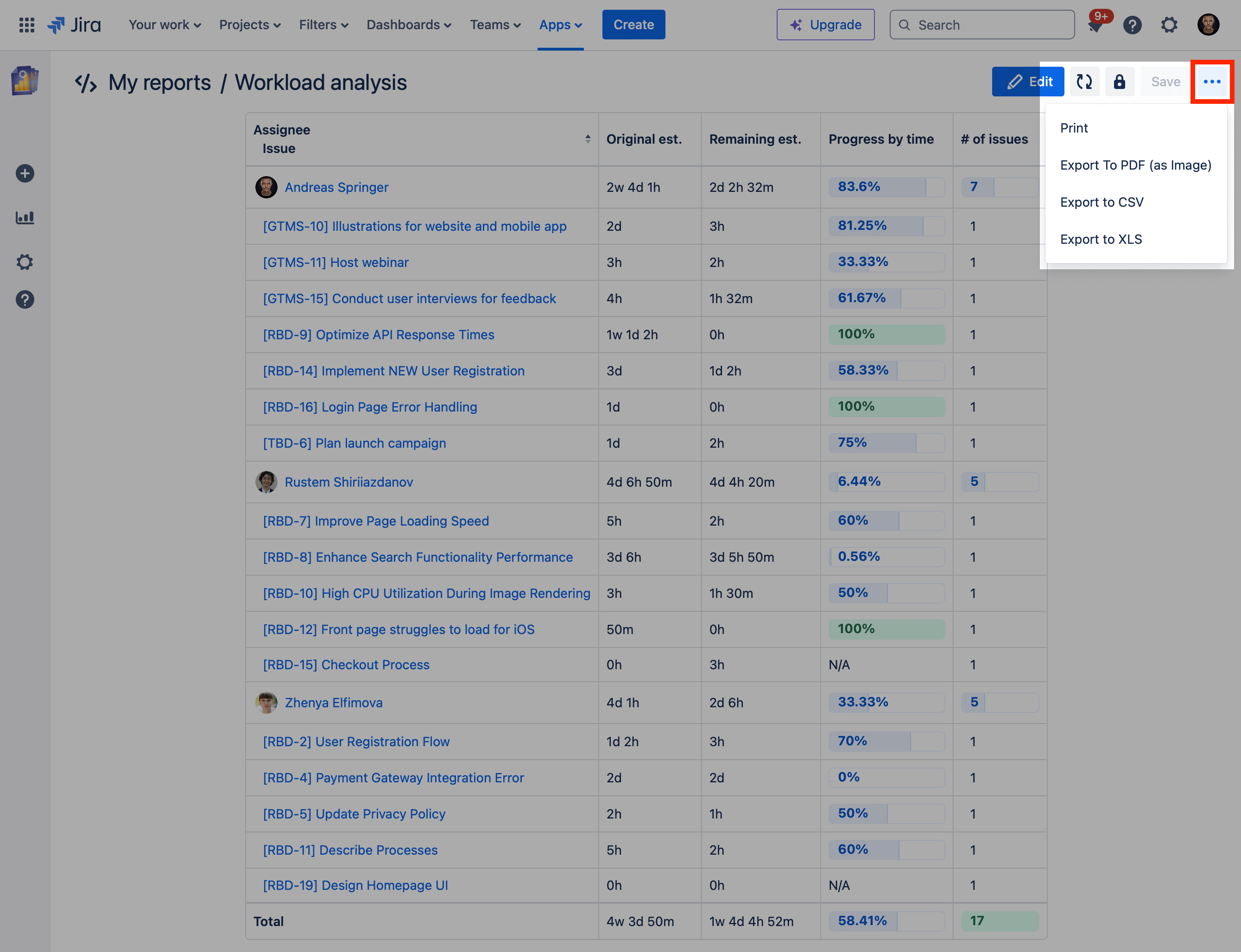
… or export the table for stakeholders outside of Jira.
